.svg)

Design That Feels Familiar: How Consistency Builds Credibility
Trust in design isn’t built overnight — it’s earned through consistency. A cohesive brand looks, sounds, and feels the same wherever you meet it: online, in print, or in person. That familiarity creates comfort. It makes your brand recognisable and reliable.
“Consistency isn’t repetition. It’s rhythm.”
Why Consistency Matters
When every visual and verbal element works together — from your logo and colours to your tone of voice — your brand becomes memorable. Inconsistency, on the other hand, creates friction. Even small mismatches in type or tone can break trust.
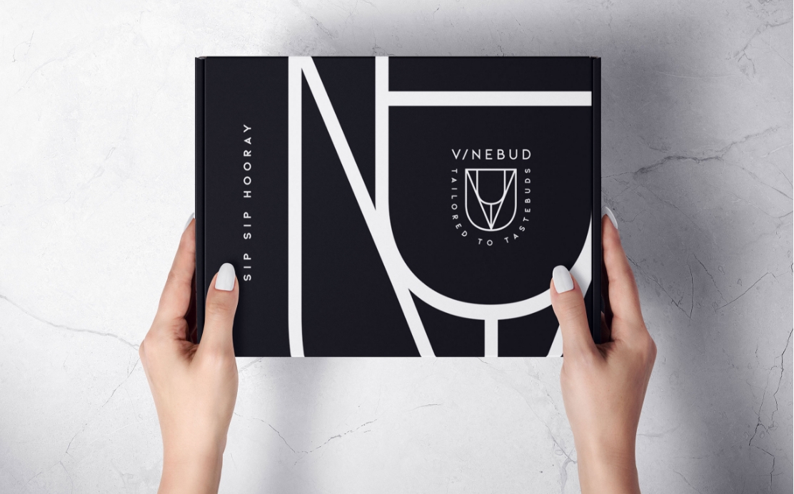
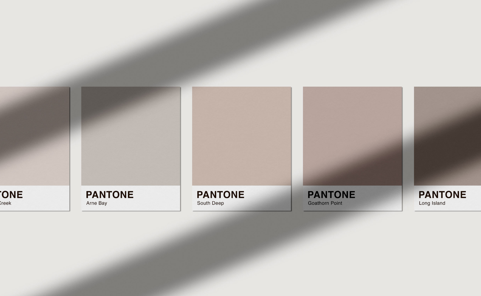
At Bare Studio, I treat every touchpoint as part of a larger system. A logo isn’t just a mark; it’s the anchor for everything that follows. The colour palette, typography, and photography style all extend that foundation.
Designing Systems, Not One-Offs
Consistency isn’t about making everything identical — it’s about creating harmony. Each piece should support the same message in its own way. A website might feel more energetic than a printed brochure, but both should speak the same visual language.
I create simple brand guides to help clients keep things aligned: colour codes, type hierarchies, image direction, tone cues. These frameworks ensure every future piece still feels like you.
How Familiarity Builds Trust
When people see consistency, they subconsciously feel security. It tells them your brand is dependable, that you care about the details, and that you deliver on your promises.This is why even small brands benefit from consistency — it builds credibility instantly.
“Design that feels familiar is design that feels trustworthy.”
Keeping It Real
Brands evolve, and that’s healthy. The key is to evolve with intention. Refreshing a palette or refining typography can strengthen recognition when done thoughtfully, not reactively.
True consistency isn’t rigid — it’s resilient. It adapts without losing its core. That’s what turns design systems into brand legacies.